Default Content Types
BlockNote supports a variety on built-in block and inline content types that are included in the editor by default. To create your own content types, see Custom Schemas.
Default Blocks
BlockNote includes a number of built-in block types. The demo below contains each of them:
import { BlockNoteView, useCreateBlockNote } from "@blocknote/react";
import "@blocknote/react/style.css";

export default function App() {
  // Creates a new editor instance.
  const editor = useCreateBlockNote({
    initialContent: [
      {
        type: "paragraph",
        content: "Welcome to this demo!",
      },
      {
        type: "paragraph",
        content: "Paragraph",
      },
      {
        type: "heading",
        content: "Heading",
      },
      {
        type: "bulletListItem",
        content: "Bullet List Item",
      },
      {
        type: "numberedListItem",
        content: "Numbered List Item",
      },
      {
        type: "image",
      },
      {
        type: "table",
        content: {
          type: "tableContent",
          rows: [
            {
              cells: ["Table Cell", "Table Cell", "Table Cell"],
            },
            {
              cells: ["Table Cell", "Table Cell", "Table Cell"],
            },
            {
              cells: ["Table Cell", "Table Cell", "Table Cell"],
            },
          ],
        },
      },
    ],
  });

  // Renders the editor instance using a React component.
  return <BlockNoteView editor={editor} />;
}
Reference
Here's an overview of all default blocks and the properties they support:
Paragraph
Appearance

Type & Props
type ParagraphBlock = {
  id: string;
  type: "paragraph";
  props: DefaultProps;
  content: InlineContent[];
  children: Block[];
};
Heading
Appearance

Type & Props
type HeadingBlock = {
  id: string;
  type: "heading";
  props: {
    level: 1 | 2 | 3 = 1;
  } & DefaultProps;
  content: InlineContent[];
  children: Block[];
};
level: The heading level, representing a title (level: 1), heading (level: 2), and subheading (level: 3).
Bullet List Item
Appearance

Type & Props
type BulletListItemBlock = {
  id: string;
  type: "bulletListItem";
  props: DefaultProps;
  content: InlineContent[];
  children: Block[];
};
Numbered List Item
Appearance

Type & Props
type NumberedListItemBlock = {
  id: string;
  type: "numberedListItem";
  props: DefaultProps;
  content: InlineContent[];
  children: Block[];
};
Image
Appearance

Type & Props
type ImageBlock = {
  id: string;
  type: "image";
  props: {
    url: string = "";
    caption: string = "";
    width: number = 512;
  } & DefaultProps;
  content: undefined;
  children: Block[];
};
url: The image URL.
caption: The image caption.
width: The image width in pixels.
Table
Appearance
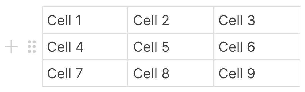
Type & Props
type TableBlock = {
  id: string;
  type: "table";
  props: DefaultProps;
  content: TableContent[];
  children: Block[];
};
Default Block Properties
There are some default block props that BlockNote uses for its default block types, and also exports for use in your own custom blocks:
type DefaultProps = {
  backgroundColor: string = "default";
  textColor: string = "default";
  textAlignment: "left" | "center" | "right" | "justify" = "left";
};
backgroundColor: The background color of the block, which also applies to nested blocks.
textColor: The text color of the block, which also applies to nested blocks.
textAlignment: The text alignment of the block.
Creating New Block Types
Skip to Custom Blocks to learn how to do this.
Default Inline Content
BlockNote includes a number of built-in inline content types. The demo editor below displays all of them:
import { BlockNoteView, useCreateBlockNote } from "@blocknote/react";
import "@blocknote/react/style.css";

export default function App() {
  // Creates a new editor instance.
  const editor = useCreateBlockNote({
    initialContent: [
      {
        type: "paragraph",
        content: "Welcome to this demo!",
      },
      {
        type: "paragraph",
        content: [
          {
            type: "text",
            text: "Styled Text",
            styles: {
              bold: true,
              italic: true,
              textColor: "red",
              backgroundColor: "blue",
            },
          },
          {
            type: "text",
            text: " ",
            styles: {},
          },
          {
            type: "link",
            content: "Link",
            href: "https://www.blocknotejs.org",
          },
        ],
      },
      {
        type: "paragraph",
      },
    ],
  });

  // Renders the editor instance using a React component.
  return <BlockNoteView editor={editor} />;
}
Reference
Here's an overview of all default inline content and the properties they support:
Styled Text
StyledText is a type of InlineContent used to display pieces of text with styles:
type Styles = {
  bold: true;
  italic: true;
  underline: true;
  strikethrough: true;
  textColor: string;
  backgroundColor: string;
}

type StyledText = {
  type: "text";
  text: string;
  styles: Styles;
};
Link
Link objects represent links to a URL:
type Link = {
  type: "link";
  content: StyledText[];
  href: string;
};
Default Inline Content Properties
TODO: This section only makes sense with the proposal in Inline Content
There are some default inline content props that BlockNote uses for its default inline content types, and also exports for use in your own custom inline content:
type Styles = {
  bold: true;
  italic: true;
  underline: true;
  strikethrough: true;
  textColor: string;
  backgroundColor: string;
}

type DefaultInlineContentProps = {
  styles: Styles
};
styles: The text styles applied to the inline content. Only useful for editable inline content types.
Creating New Inline Content Types
You can create your own custom inline content using React - skip to Custom Inline Content to learn how to do this.
You can also create custom styles to apply to StyledText - skip to Custom Styles to learn how to do this.